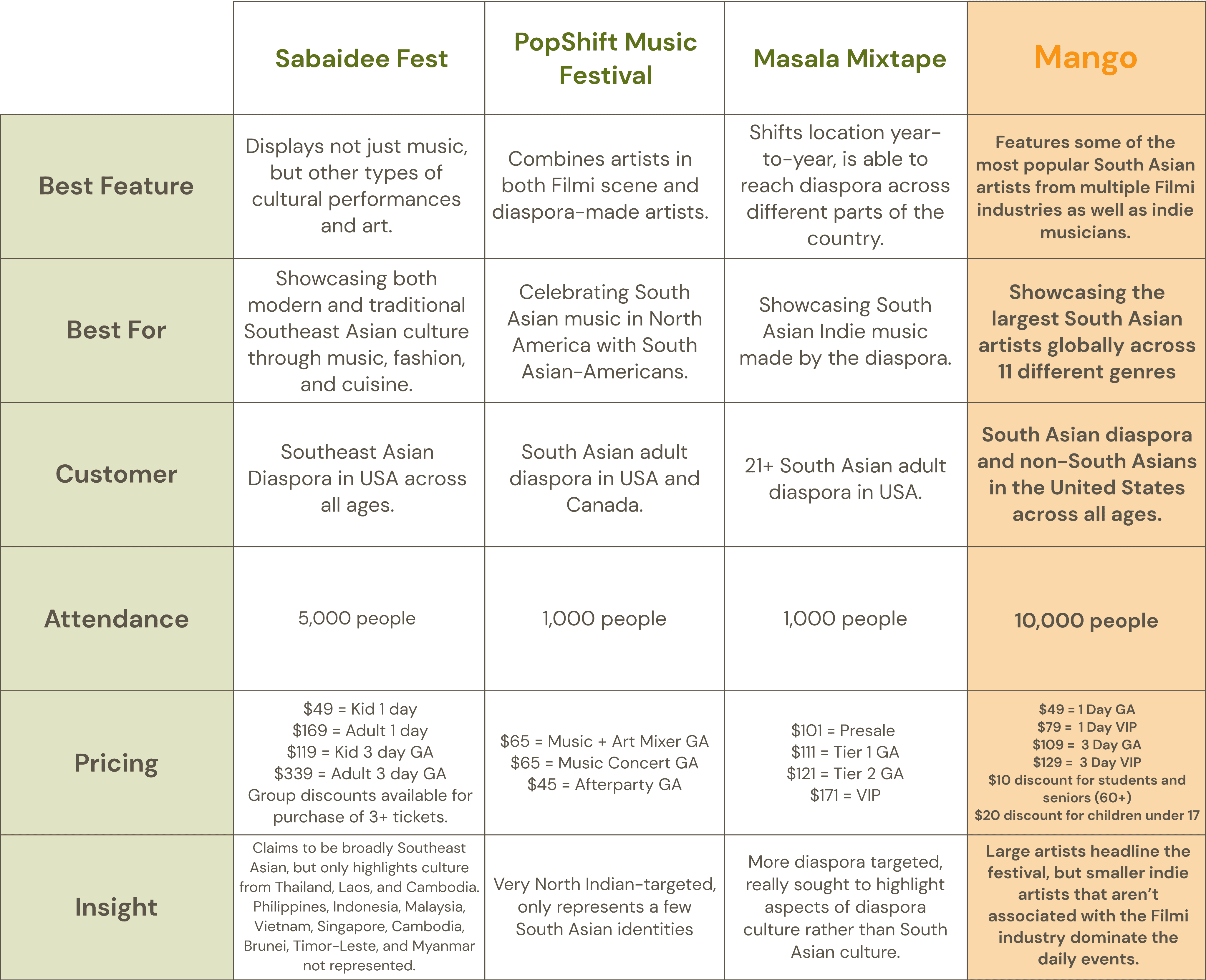
Class Project - Visual Communication in HCDE | March - June 2024

Class Project - Visual Communication in HCDE | March - June 2024

Mango: South Asian Music Festival

Mango: South Asian Music Festival

Overview

Mango is a 10-week project dedicated to establishing a strong brand identity and visual system for a fictional South Asian music festival at the University of Washington.

Mango is a testament to the diversity of South Asia, featuring the largest South Asian artists from across the globe, spanning eleven genres from rap to Hindustani classical and Filmi to hyperpop. Unlike other South Asian music festivals in North America, which are typically targeted towards older members of the South Asian diaspora and mainly showcase North Indian culture, Mango is targeted towards a younger demographic and represents a more diverse range of South Asian identities through a carefully curated selection of South Asian artists.

View Final Prototype

Team Members

Sushma Shankar


Duration

10 weeks


Tools

Figma


My Role

UX Designer, UX Researcher, Branding Designer, Graphic Designer

View Final Prototype

Mango is a 10-week project dedicated to establishing a strong brand identity and visual system for a fictional South Asian music festival at the University of Washington.

Mango is a testament to the diversity of South Asia, featuring the largest South Asian artists from across the globe, spanning eleven genres from rap to Hindustani classical and Filmi to hyperpop. Unlike other South Asian music festivals in North America, which are typically targeted towards older members of the South Asian diaspora and mainly showcase North Indian culture, Mango is targeted towards a younger demographic and represents a more diverse range of South Asian identities through a carefully curated selection of South Asian artists.

Team Members

Sushma Shankar


Duration

10 weeks


Tools

Figma


My Role

UX Designer, UX Researcher, Branding Designer, Graphic Designer

View Final Prototype

Research

Competitor Analysis

I began curating Mango by comparing three music festivals held in the United States that were targeted towards Asian-American diasporas, primarily South Asian Americans. Upon conducting research about competing music festivals, I found that attendance was relatively smaller at Asian music festivals and that pricing wasn’t standardized and instead typically divided by tiers. When choosing which features to include in Mango, I wanted to remain competitive and relevant to similar festivals. For example, I really liked how Sabaidee Fest was best for showcasing artists from both Southeast Asia and diaspora artists, so I chose to reflect that idea in Mango as well.

Personas and Customer Journey

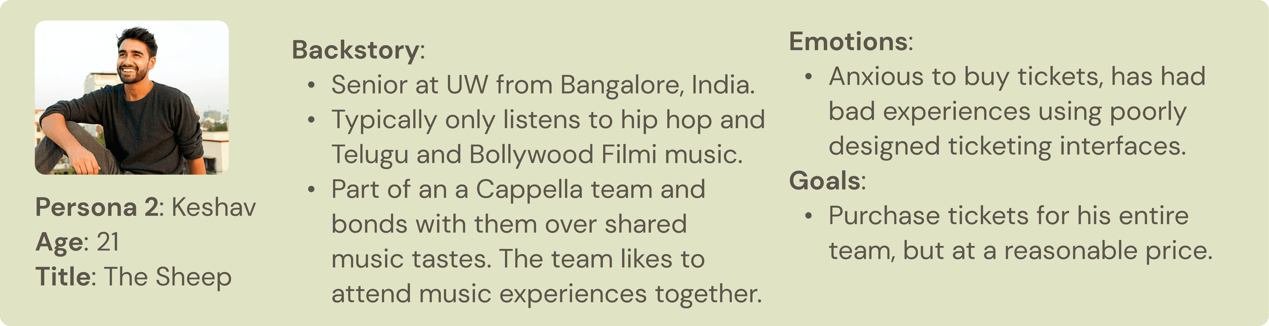
I created three personas to demonstrate the different perspectives that attendees of my festival might fall into. By focusing on the motives and goals of each persona, I was able to design thoughtfully by considering different viewpoints.

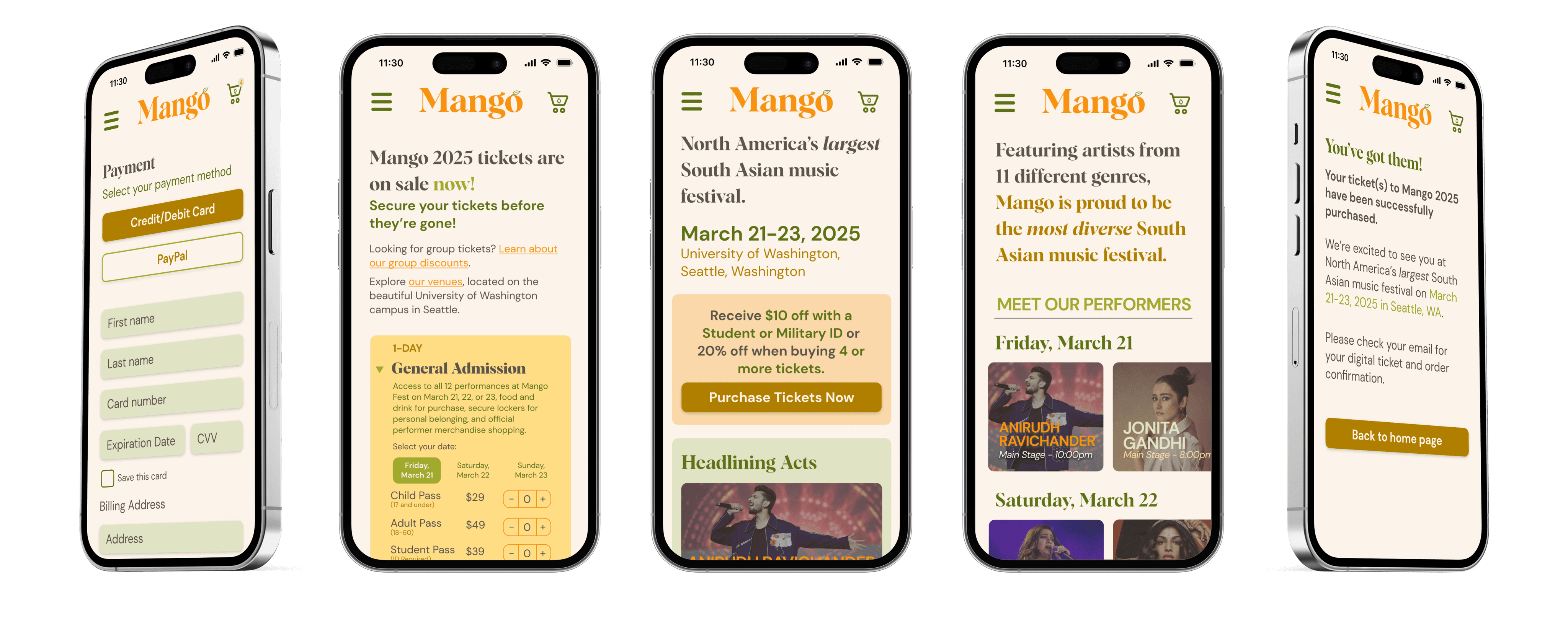
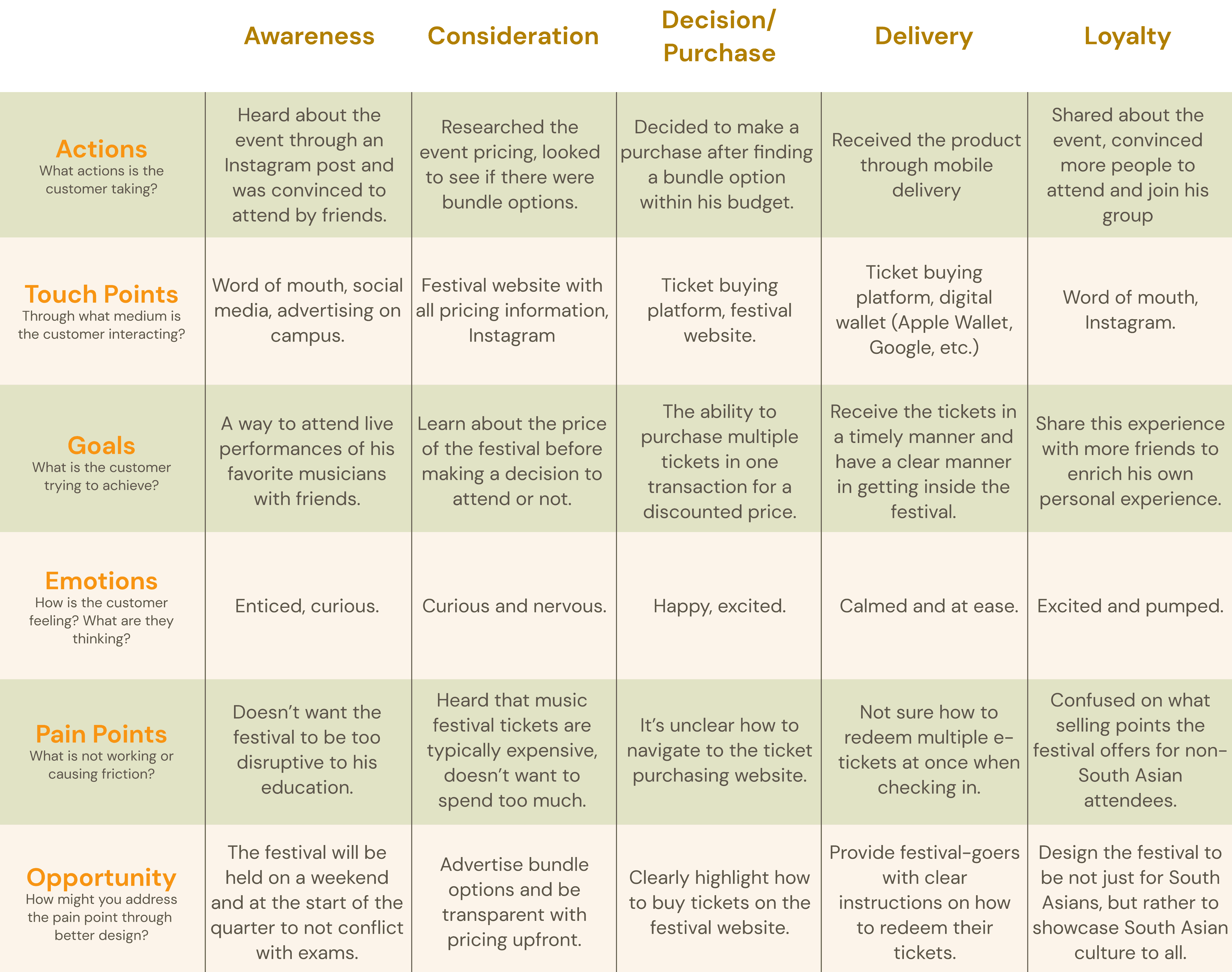
This persona, Keshav, represents the target demographic for my festival: a student that is likely to attend the festival if it’s within a reasonable budget and offers group discounts. His poor experiences with ticketing was helpful when developing a mobile interface that focused on purchasing tickets for the festival.
When creating a customer journey map for Keshav's persona, I identified that I want the target demographic of Mango to be students and should design the festival accordingly.

This choice was reflected in my decision to have Mango take place during the University of Washington's spring break to avoid clashing with finals.

I also realized that it’s important to develop a clear pathway for users to purchase tickets and ensure that all relevant information is well communicated.

Branding

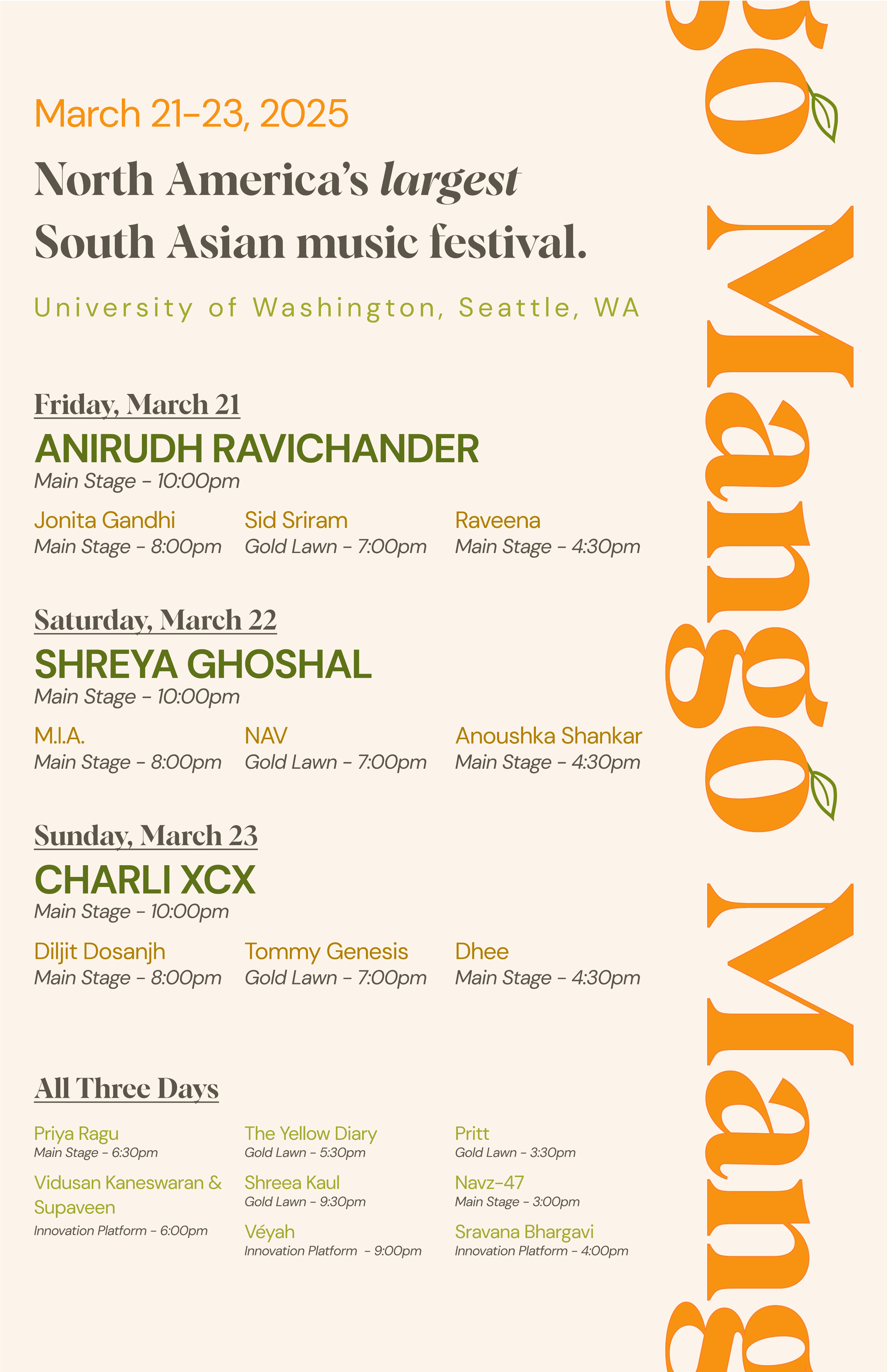
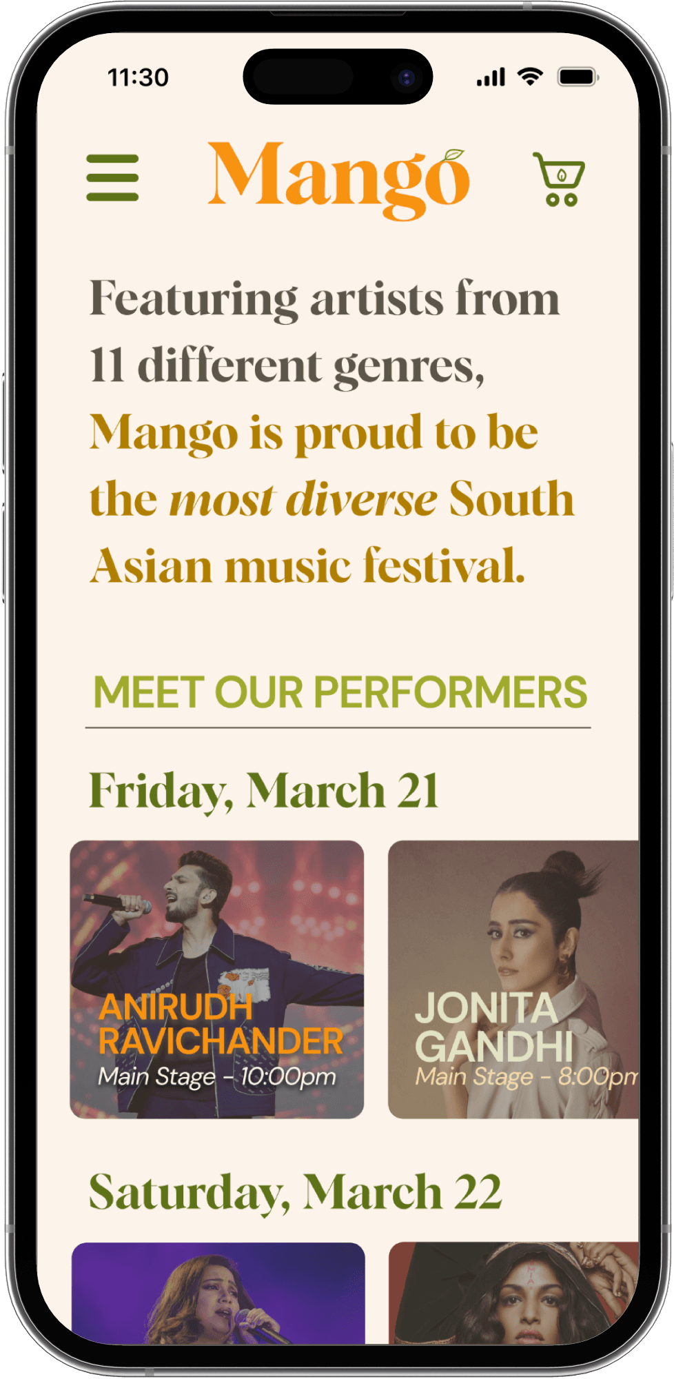
Wordmark and Logomark

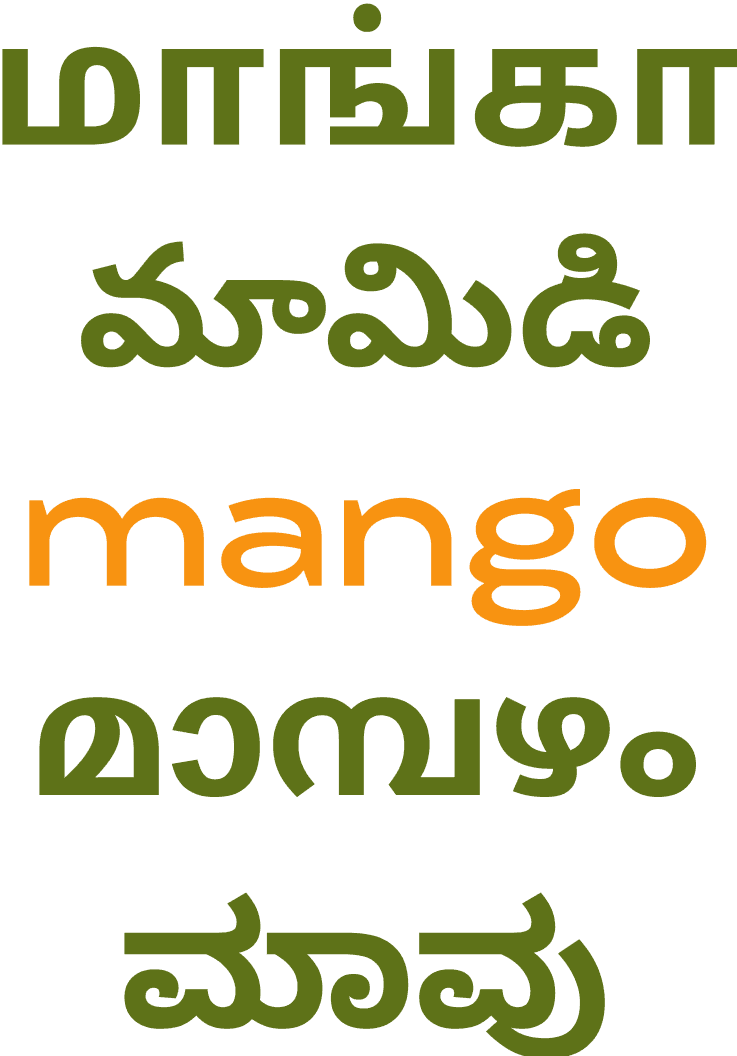
My design process began with deciding a festival name and developing its wordmark. I chose to name my festival Mango, to pay tribute to the national fruit of three South Asian nations and celebrating South Asian culture at this festival beyond the festival lineup.

The name Mango celebrates an element of multiple South Asian cultures, while still using an English word to connect a bridge between Western and Asian culture, conveying a feeling of unity, sophistication, and cultural integration.
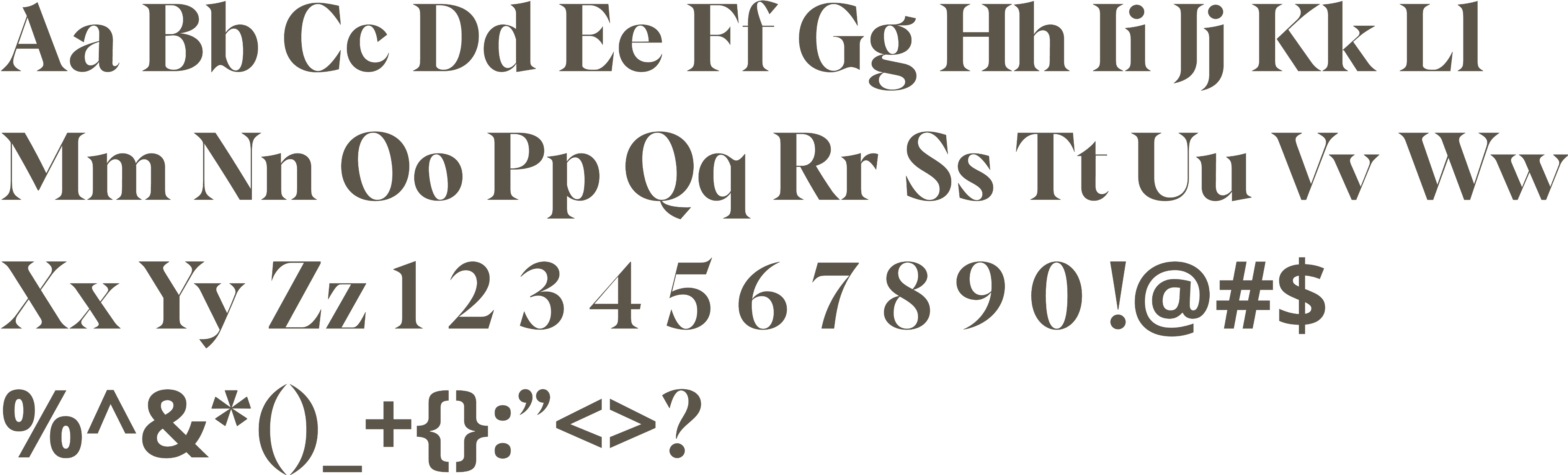
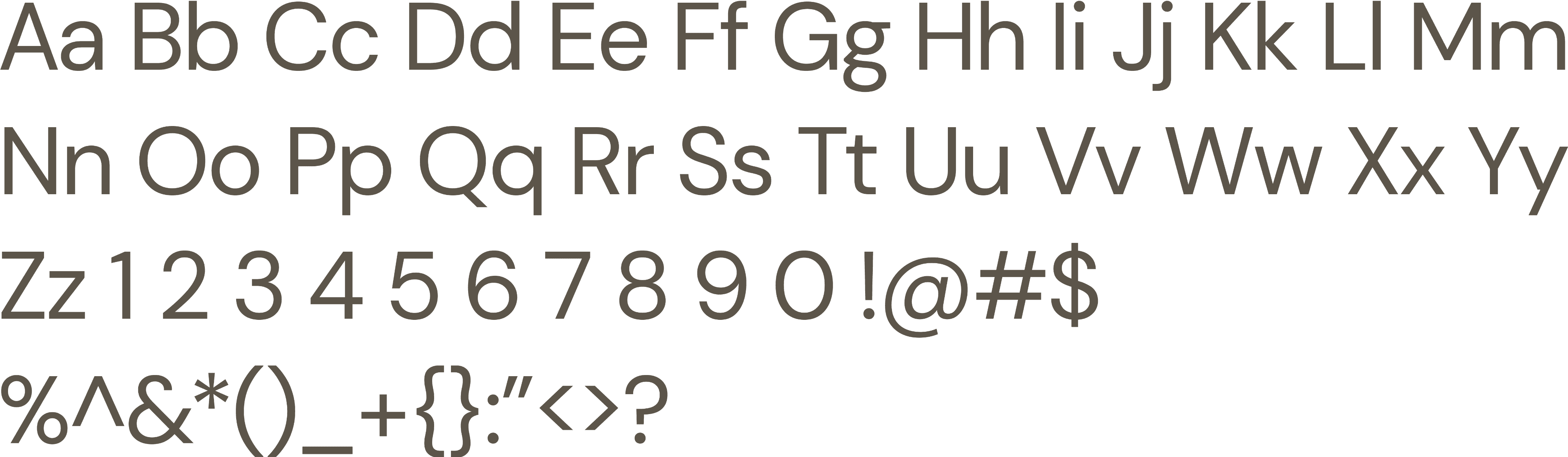
I chose Albra Display, a semibold serif font, for my wordmark. The font uses a contrast of thick and thin stems and slanted axes, which creates a sense of playful elegance. I felt that using a font with both thick and thin stems further emphasized the feeling of sophistication. Albra’s slanted axes, as seen in the ‘o’, reminded me of an actual mango, so I decided to use it in my logomark to resemble the fruit by adding a leaf motif on top of the letter.

In my initial iterations, I played around with using Fontspring and a bolder version of Albra Display. I loved the bouncy and elongated look that Fontspring had, as it was reminiscent of the scripts of multiple South Indian language scripts, which I played around with in my logomark iteration. I however decided to use Albra Display, but felt that the bold version of the font didn’t have stems as thin as I wanted, so I instead opted for the semibold version.
Final Logomark
Final Logomark
Wordmark Iteration 1
Wordmark Iteration 2

Logomark Iteration

Typography

My chosen wordmark font was Albra Display, which is a semibold serif font, and my font pairing is DM Sans, a sans serif font.
I chose to use Albra Display for my wordmark because I felt that its contrast between thin and thick stems paired alongside angled serifs gave it a sophisticated look, but I felt that the bold style was just too thick, and that semibold was more subtle. I also really liked the slanted axes in the ‘o’, which I used in my logomark.


I chose to use DM Sans, a sans serif font, for my font pairing because I wanted to contrast against the weight and strong serifs of Albra Display while still keeping similar descenders, necks, and bowls in the individual letters. I also reduced the tracking in DM Sans by -3 to maintain the feeling of sophistication and sleekness. I also often utilized the bold version of DM Sans to establish more contrast with my uses of my font pairing.

Wordmark Font: Albra Display Semibold

Font Pairing: DM Sans

I chose to use Albra Display for my wordmark because I felt that its contrast between thin and thick stems paired alongside angled serifs gave it a sophisticated look, but I felt that the bold style was just too thick, and that semibold was more subtle. I also really liked the slanted axes in the ‘o’, which I used in my logomark.

Wordmark Font: Albra Display Semibold

I chose to use DM Sans, a sans serif font, for my font pairing because I wanted to contrast against the weight and strong serifs of Albra Display while still keeping similar descenders, necks, and bowls in the individual letters. I also reduced the tracking in DM Sans by -3 to maintain the feeling of sophistication and sleekness. I also often utilized the bold version of DM Sans to establish more contrast with my uses of my font pairing.

Font Pairing: DM Sans

Colors

I wanted to convey a feeling of earthiness and modernity while paying homage to the festival’s name through my color scheme. To accomplish this, I chose a analogous color palette featuring different shades of yellow, orange, and green to reflect the colors of a mango. I also decided to pick an analogous palette because the natural transition between colors reflected a harmonious transition similar to those found in nature. Additionally, the off-black and olive tones found in some of the shades are milder in tone, giving a more modern feel.

Festival Poster and Artifacts

I created multiple artifacts for my festival, including a poster, commemorative ticket, infographic, and wayfinding materials. I played around with the ways in which I could utilize the established branding while maintaining a sense of consistency.
In my festival poster, I chose to only use my wordmark font for my dates and festival tagline to not detract away from the wordmark itself. I chose to underline the dates within the poster to further accentuate that important piece of information, even though the point size of the dates are smaller than the other uses of Albra Display in the poster.

I used DM Sans to experiment a lot more with creating a hierarchy within my poster while still using titlecase. For my headline performers, I chose to make them in all caps and bolded so that they would stand out against the other text. Show timings are italicized and have a smaller point size to not detract from the performer names, since my intention is for someone reading my poster to not need to read the performance timings unless they were one foot away from the poster. Lastly, I introduced positive tracking to declare the festival’s location, Seattle, since that was a unique piece of information that wasn’t expressed anywhere else on the poster and I wanted it to stand out.
I designed a commemorative ticket that was personalized to the headlining artists and incorporated my various branding elements, specifically my typeface, logomark, and color scheme. I chose to make my ticket double sided to allow for more creative elements on my ticket and space out the information more. I also included the artist’s album title, a picture of the artist, and the mango motifs. This allowed me to utilize the full extent of my creativity without being concerned about crowding the small space on the ticket.
I surveyed 20 UW students and used the data to develop my infographic. I wanted to communicate the factors that makes Mango unique in comparison to other music festivals and to other South Asian music festivals, such as the diversity in music genres and the amount of attendees.
I began by developing a festival map to highlight the location of Mango within the UW Seattle Campus. I chose to utilize my color hierarchy in my map, with main locations in darker colors, such as the stages, streets, and walkways. I sparsely used Albra Display, my wordmark font, so that the few uses of it would stand out on my map, such as the numeric and letter symbols to represent locations. I also included pointers towards Red Square and The Quad, as they are other signature landmarks on the UW Campus.
For my signage, I chose to create a freestanding board located at a street corner. My sign uses simple arrow vectors to steer and direct the user in the correct direction of the different stages. It also uses the festival map to direct the user on what they’ll find in different parts of campus. My expectation is that a user that wants to know more information would approach the signage closer to read the map, but the arrows pointing to the stages are visible from a further distance. I chose make my light green shade the primary color for the board over the light tan shade to accentuate my festival map on my signage.

Mobile Interface

User Flow

I had about 2 weeks to work on the mobile interface and decided to focus on the user task of purchasing a ticket, and wanted to emulate the experience of my persona, Keshav.

Keshav is trying to purchase multiple tickets for a large group of people wanting to attend Mango, and I felt that his goal best aligned with the task for my flow. By creating a user flow suited to his task, I was able to thoughtfully think about how I would prototype this task in my wireframes.

Through developing this user flow, I was able to consider the different ticketing options that I would want my festival to offer, such as different passes, demographic discounts (such as student discounts), and other information that would be relevant to the user. I also had to consider the process of onboarding as a new user and creating an account.

Icons and Buttons

Prior to beginning development of my mobile interfact, I developed and identified the icons and buttons that I would use. My aim was to ensure that they were easy to comprehend while also remaining consistent with the rest of my branding.
I began by developing five icons; home, tickets, cart, map, and lineup.

I wanted the icons to relate to my logomark by maintaining the sense of unification and incorporating the leaf in the logomark throughout all of the icons. In my previous iterations, I played around a lot with what sort of consistency I wanted to establish in my icons, and decided that I wanted to use thick, rounded edges while incorporating the leaf from my logomark. I used a consistent stroke size throughout all of my icons to maintain a consistent scale in order to accomplish this. This is similar to the thick downstroke stems in my wordmark.

My initial iteration of my cart icon was a star, but I decided to redesign it to be an actual cart after receiving feedback that its intent was confusing.

Icons displayed at 100pt and 25pt

All of the leaf motifs were drawn by myself. The inspiration for the home icon was taken from Iconify, but drawn by myself in Figma after making some changes. All components in the ticket icon were drawn by me, except for the leaf imagery, which is from the Noun Project, Rachel Fredericks. The cart and lineup icons are from Iconify.

Developing my button hierarchy was a process that took on lots of revision and modification. I settled on using theme colors that weren’t as prevalent in my wireframes to accentuate the importance of the buttons.

In my UI, the primary button is used to indicate moving forward in the user flow, such as navigating to the ticket purchasing screen, adding to cart, or continuing to the checkout screen. In a situation where the user would have to pick between two different buttons, the primary button will be used to accomplish the main goal that moves the user forward in the user flow, while the secondary button will represent a more static action. For example, on the sign in screen, the primary button is used for the user to navigate forward and complete signing in, whereas the secondary button is there to allow to the user to create a new account instead, moving them backwards in the user flow.

Wireframes

Utilizing all of the content I had created prior, I began developing the initial wireframes for a mobile ticketing app that attendees of Mango would use, referring back to the user flow that I had created.
Low and Mid Fidelity Iterations
While completing user testing, I received feedback about my text being small, logos not being well defined, and not having enough information about ticketing. To fix these issues, I made the following changes:
— Ensured that no text on any of my screens was smaller than 11 pt.
— Developed more information for the ticketing screens to ensure that a user would be able to clearly navigate the interface and successfully add their desired tickets to the cart.
— Removed the bottom-fixed navigation bar in lieu of just keeping the hamburger menu at the top to resolve the issue of poorly-defined icons
— Modified the quantity selection button - made it larger and easier to click on a mobile screen.
— Added a toast notification when an action has been completed to convey completion of an action.

Final Prototype

My final prototype incorporates the feedback from user testing and culminates all elements of my developed branding for Mango, particularly through a consistent color and type hierarchy.

Click through the prototype and try to purchase 1-Day General Admission student pass tickets for Friday!

Takeaways

One of the key highlights of this project was the development of a strong brand identity and consistent design language across all materials created for Mango. I gained valuable insights into the importance of creating UI with a specific user pathway through the constant revision of my user flow, influencing me to continuously text my UI as I developed the final prototype. Lastly, this project would not have been the same without the critique of my peers, course instructors, and industry professionals that volunteered their time to provide advice to students. Their direct and specific critiques allowed me to iteratively edit and refine my designs.

HCDE 308 has been my favorite class at UW to date. I was deeply excited by the prospect of combining multiple passions in one project - graphic design, user experience, and South Asian music and culture. I truly enjoyed every moment of developing my festival and appreiciated the balance between creative freedom and the constraints of the project, such as the location and duration of the event. My experience in this course has sparked a stronger interest in how UX designers can effectively apply design fundamentals to create impactful solutions in their work.