


Overview
Timely is a productivity timer app designed for college students with ADHD.
Our team sought to understand the existing challenges for this demographic to thoughtfully and intentionally design a tool that would help students take control of their studying.
Problem
20% of college students with Attention-Deficit/Hyperactivity Disorder drop out because the education system is not designed for their success.
ADHD is considered to be an “invisible disability”, as it’s not often physically visible in individuals. Often times, students with ADHD fail to seek a diagnosis until adulthood because of a lack of understanding of their symptoms.
How might we holistically support college students with ADHD, whether diagnosed or undiagnosed, to enhance their habits and academic experiences?
Research
We first conducted research to better understand the experiences and challenges experienced by students with ADHD, and did so in five stages.
Surveying
The first step in our research process was creating an online survey to send out to possible members of our target demographic. Reflecting upon our own experiences and external sources found on the internet, we wrote 26 questions to ask survey participants.
We received over 20 responses and were able to use the responses to identify common struggles felt by students with ADHD, and then develop an interview protocol to dive deeper into these sentiments.


Survey respondents detailing the social barriers they face as a result of ADHD.
Interviews
To understand the perspectives of our target users, we conducted 5 user interviews with survey respondents.
Maintaining a conversational flow, we sought to seek a glimpse of how college students with ADHD approached school work and if there were any parallels between their academic and personal routines.
We had three participants complete a card sorting activity, and had the other two complete diary entries and create a visual schedule.


Takeaways
From our research, we identified three main struggles faced by students with ADHD.
1) Academic burnout is recurring and common.
2) ADHD makes it difficult to stay on top of tasks.
3) Existing products aren’t tactile.
Ideation
Values and Strategy
The next stage of our project was to narrow down the details of our project and identify the shape of what we wanted to eventually create. We began this process by identifying the 3 ideation values that we wanted to represent in our project.
Goal Oriented
We wanted to prioritize keeping students on track to meet their academic goals.
Adaptive
Preventing Burnout
Encouraging academic success over a longer period of time with appropriately timed breaks.

Competitive Analysis
We conducted a competitive analysis of existing tools and apps that students with ADHD widely used, including our research participants. As a team, we really liked tactile tools and tools that would reward users for not using their phones. However, amongst all of the competitors, we found a lack of adaptiveness.

Forest (Mobile App)
Pros: Limits phone usage and aims to improve focus by rewarding users as they complete tasks.
Cons: Not very engaging, has a paywall.

Focus Keeper (Mobile App)
Pros: Uses the Pomodoro timer method and has data visualizations of progress
Cons: Doesn’t adapt to other study methods.

TickTime (Physical Pomodoro Timer)
Pros: Tactile object that has customizable and personalizable settings.
Cons: Doesn’t keep phones away and has an unappealing design.
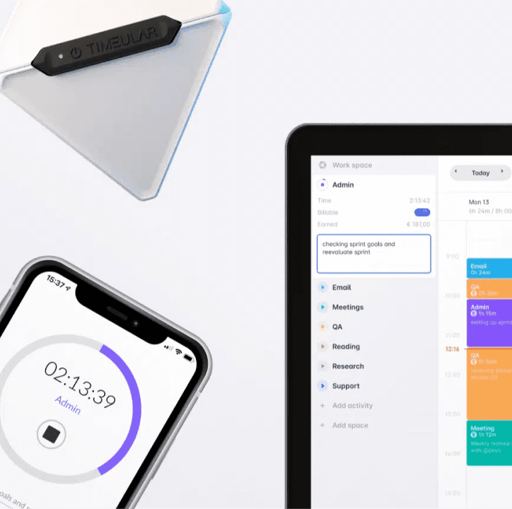
Timeular (Physical Time Tracker)
Pros: Captures detailed data on work habits and frequency of breaks.
Cons: Not designed to increase productivity, only collects data.
Outcome
Reflecting on the existing competition, our ideation values, UX strategy, and our emphasis on tactility, motivation, and engagement, we decided to create Timely, a physical timer paired alongside a mobile app, to solve our problem.
Timely sought to provide uninterrupted study sessions using a tactile product that would connect to an interface aligning the student’s study strategy with their academic success.
Referring back to our ideation values, we identified and roughly sketched the key features that we wanted Timely to have.
Tactile and Interactive
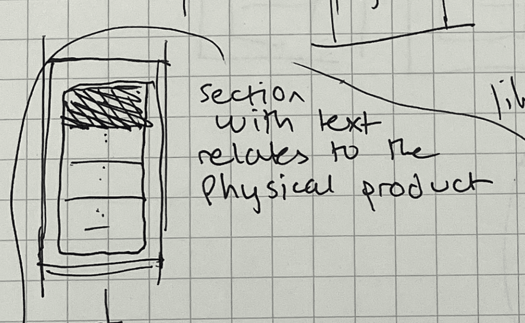

Tactile and Interactive

Goal Setting

Design
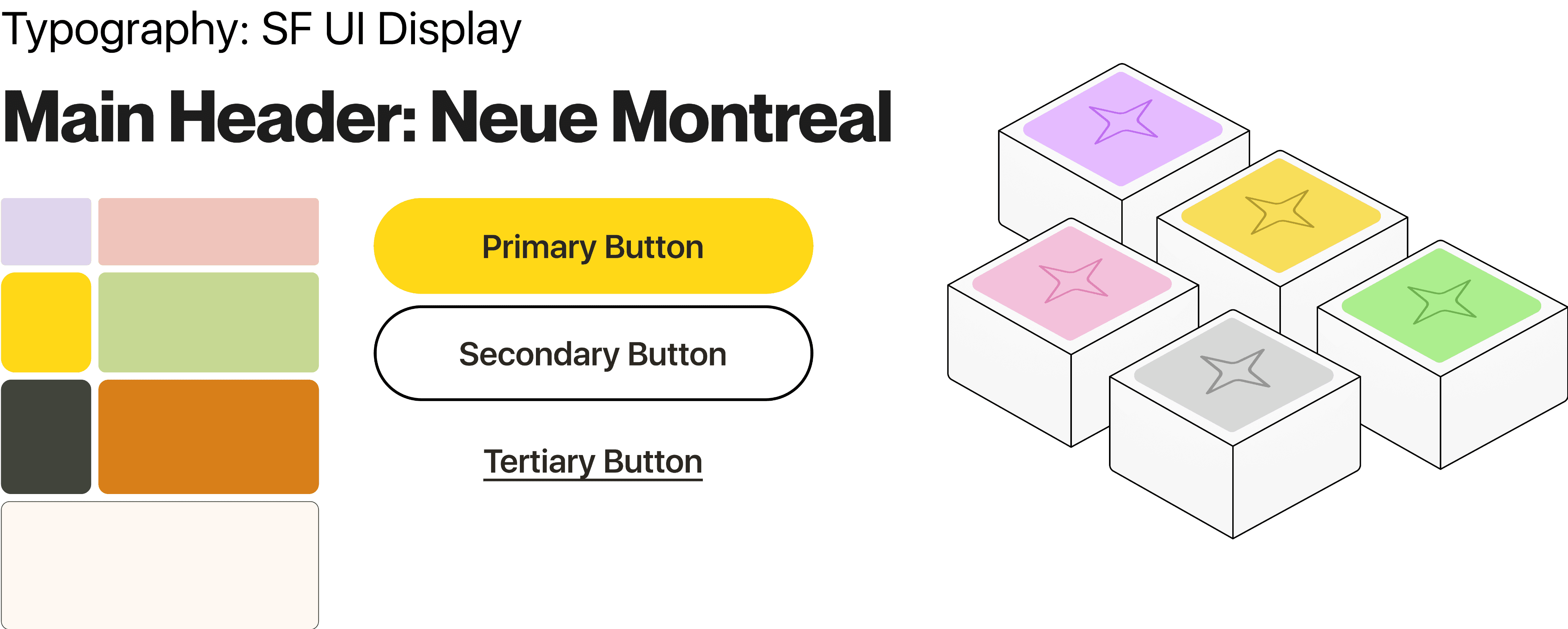
To begin developing the design of Timely, we created a moodboard of different patterns and images that reflected our ideation values and UX strategy. Our final collage compiled bright designs that were easygoing, optimistic, rhythmic, innovative, and versatile.

As we developed our UI, we noted that simplicity and straightforwardness was crucial to us. We wanted to make sure that we used inviting yet bold colors that were paired alongside readable text styles.
Prototype Iterations
As we entered the final few months of our project, we kicked into full gear working on the user interface of Timely. I primarily worked on the motion design of our product, but contributed to product design as well, assisting with UI design for the onboarding and statistics screens.
Iteration 1
In our first iteration, we used our preliminary sketches to establish the the general look of the home and statistics screens.
As a motion designer, I began developing frames to depict the interactions between screens.


Iteration 2
In this iteration, the product design team worked on incorporating the feedback, to which I would assist them with any tasks that needed to be done.
As a principal member of the motion design team, I used Figma’s prototyping abilities to animate many of the screens that we had created rough storyboards of in the prior iteration.
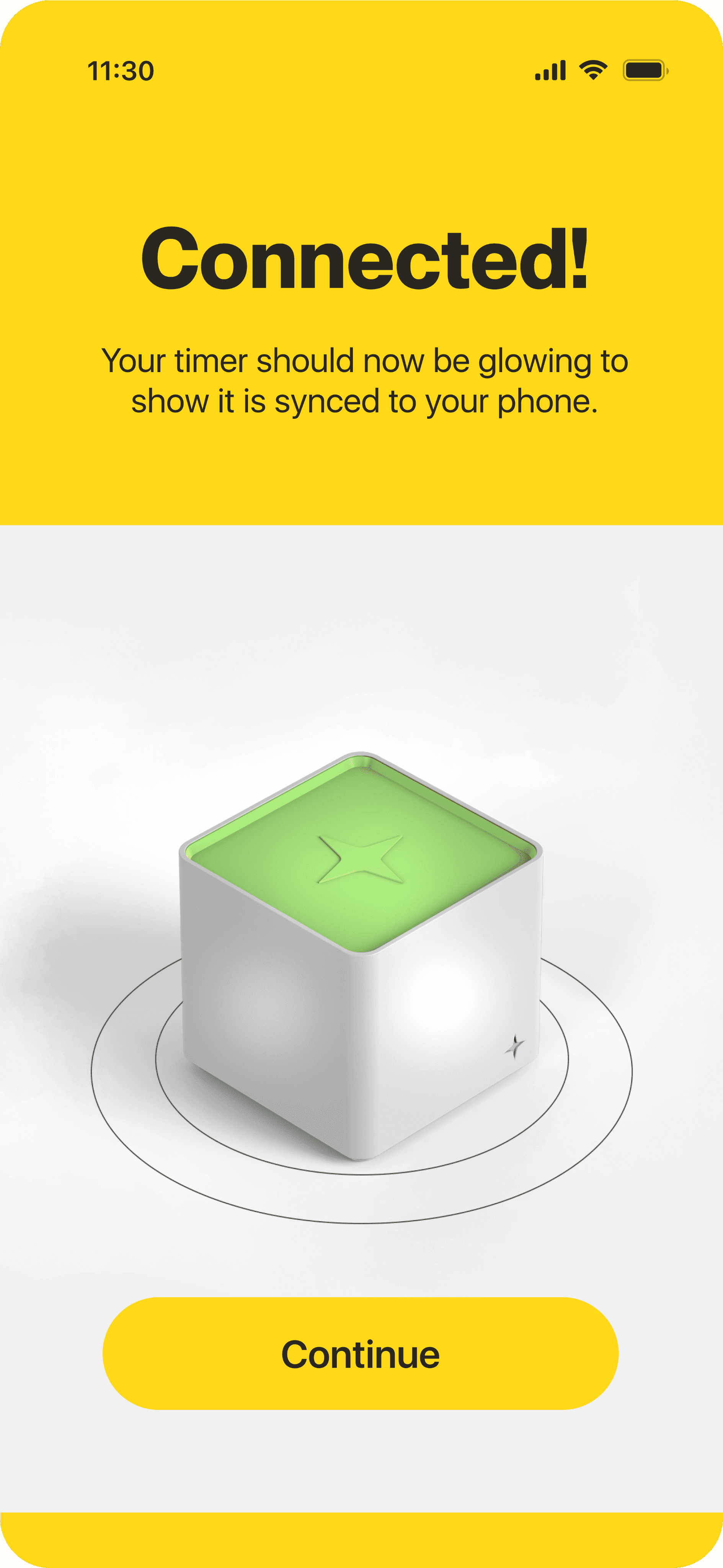
We changed the flow of the onboarding animation to be more playful and to imitate how the user would use the physical product - by stacking the blocks.
We chose to keep the yellow Brain Power slider and grey text box when users assigned and created tasks, developing animations for these features. We received internal feedback from the rest of the team that the animation was too slow, particularly for the blur effect to wear off. Additionally, there were inconsistencies in the colors and the names of the homework assignments.
Furthering our development of the onboarding process, we developed a flow for a trial run in this iteration. This animation emulated the movement of the blocks that we were going for, but was too harsh and moved too fast.
Choosing to move forward with the multicolor version of the statistics page from Iteration 1, we developed motion design for the blocks in the background. The product design team did not have enough time between iterations to make substantial changes to the design of the screen,
In this iteration, we also conducted usability testing of both digital and physical prototypes with three students that had ADHD.
Feedback on Digital Prototype
Pros:
3/3 participants felt that the visual design is inviting and attractive
3/3 believed that this would be effective for students with ADHD
Cons:
3/3 felt that the trial run was too repetitive and was not very intuitive
2/3 said that the flashy colors of the home page isn’t comforting
Solution and Final Product
To conclude the 8 month process of developing this project, we presented the physical and digital prototypes of Timely at the 2024 UW Design for America showcase. View our final prototype here.


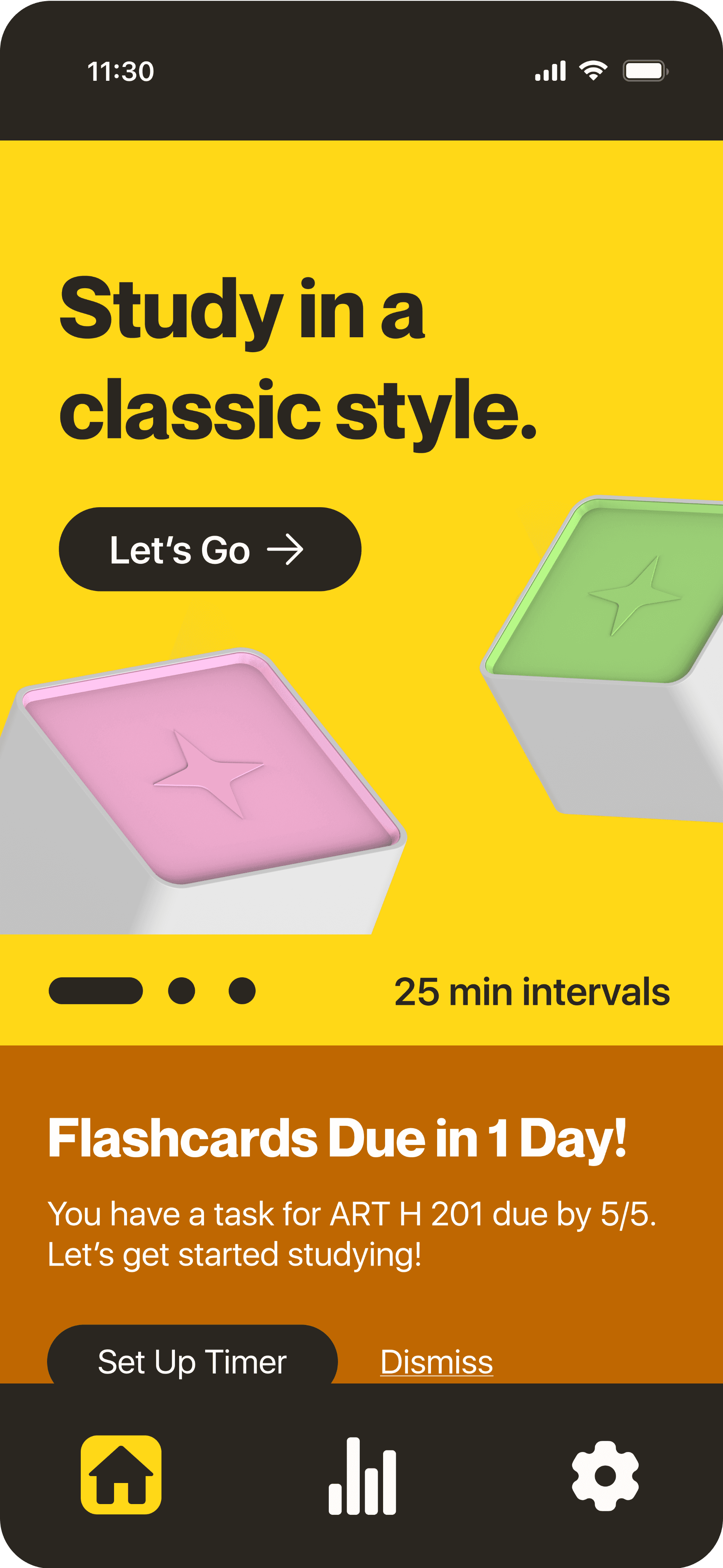

Key changes made to our final prototype:
● Incorporated both illustrations and images of the 3D renders of our physical product created by our industrial designer.
● Mellowed down the color usage on our home page, kept it predominantly yellow with green and pink accents.
● Developed horizontal carousels throughout the homepage, allowing for better organization of information.
Takeaways
There is a stark difference between the designer I was at the start of this project and at the end. I learned so much from all of my teammates, across fields such as UX research, product design, product management, and leadership. I attribute a lot of my success and personal growth from working on Timely to the relationships I built with my teammates, who became pillars of friendship and support inside and outside of the project. My main takeaways are:
1) Communication and clear organization is vital to success as a leader.
Our project lead ensured that she was constantly communicating her the team and clearly detailing the goals she wanted to accomplish each week. By establishing clear deadlines and timelines at the start of each stage in the project as well as sending weekly update emails, each member of the team knew what they were personally responsible for.
2) Design is an experience, not just a visual.
Through developing a product that was both physical and digital, I learned the importance of curating a smooth and consistent user experience between both forms of our product. As a motion designer, I was able to really engage with this concept through developing digital prototypes that had motion that maintained our comforting brand identity.